Introduction: Coordinating wood tones throughout your home creates visual harmony and showcases the natural beauty of your Amish furniture. While the old rule of "all wood must match" is outdated, understanding how to thoughtfully combine different wood species and finishes elevates your interior design from chaotic to cohesive.
Understanding Wood Tone Basics
The Three Categories of Wood Tones:
1. Light Woods (Cool to Neutral)
- Maple - creamy white to light tan
- Ash - pale tan to light brown
- Birch - light yellow to cream
- Pine - pale yellow with warm undertones
2. Medium Woods (Warm)
- Oak - light to medium brown with golden undertones
- Cherry (young) - pinkish-brown aging to reddish-brown
- Hickory - tan to medium brown with dramatic grain
3. Dark Woods (Rich and Deep)
- Walnut - chocolate to deep purple-brown
- Cherry (aged) - deep reddish-brown
- Mahogany - reddish-brown to deep red
The Modern Approach: Mixing Wood Tones Successfully
Key Principles:
- Vary the tones (light, medium, dark) rather than matching exactly
- Maintain consistent undertones (warm or cool)
- Balance the visual weight across the room
- Use the 60-30-10 rule for wood tone distribution
- Let one wood tone dominate
Matching Strategies by Wood Species
Styling Oak Furniture
Oak Characteristics:
Medium tone with warm golden undertones and prominent grain patterns.
Complementary Woods:
- Lighter: Maple, ash (creates contrast)
- Similar: Hickory, light walnut (harmonious blend)
- Darker: Walnut, aged cherry (adds depth)
Design Tips:
- Oak pairs beautifully with both warm and cool color palettes
- Use oak as your dominant wood (60%)
- Add darker accent pieces for visual interest
- White oak works well in contemporary spaces
- Red oak suits traditional and rustic styles
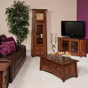
Styling Cherry Furniture
Cherry Characteristics:
Starts light pinkish-brown, ages to rich reddish-brown with warm undertones.
Complementary Woods:
- Lighter: Maple, birch (provides contrast as cherry darkens)
- Similar: Oak with warm stain (harmonious pairing)
- Darker: Walnut (sophisticated combination)
Design Tips:
- Cherry's reddish tones pair well with warm neutrals
- Avoid competing red tones in fabrics and walls
- Use cream, sage, or soft blue to balance warmth
- Remember cherry will darken over time
- Perfect for traditional and formal spaces
Styling Maple Furniture
Maple Characteristics:
Light, creamy color with subtle grain and cool to neutral undertones.
Complementary Woods:
- Similar: Ash, birch (cohesive light palette)
- Medium: Oak, light cherry (adds warmth)
- Darker: Walnut, dark cherry (dramatic contrast)
Design Tips:
- Maple's light tone works in contemporary and Scandinavian styles
- Pairs beautifully with cool grays and whites
- Add darker wood accents to prevent washed-out appearance
- Natural maple finish showcases clean, modern aesthetic
- Stained maple can mimic cherry or walnut
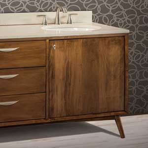
Styling Walnut Furniture
Walnut Characteristics:
Rich chocolate to deep purple-brown with straight grain and sophisticated appearance.
Complementary Woods:
- Lighter: Maple, ash (creates striking contrast)
- Medium: White oak (balanced, modern pairing)
- Similar: Dark cherry (cohesive rich palette)
Design Tips:
- Walnut anchors spaces with its rich, dark tone
- Pair with lighter woods to prevent heaviness
- Works beautifully in mid-century modern and contemporary designs
- Complements both warm and cool color schemes
- Use as accent pieces (30%) with lighter dominant wood
The 60-30-10 Rule for Wood Tones
How to Apply:
- 60% - Dominant Wood: Main furniture pieces (dining table, bed, dresser)
- 30% - Secondary Wood: Supporting pieces (nightstands, chairs, bookcase)
- 10% - Accent Wood: Small pieces (picture frames, decorative boxes, accessories)
Example Application:
Living Room:
- 60% - Oak entertainment center and coffee table
- 30% - Maple end tables and bookcase
- 10% - Walnut picture frames and decorative bowls
Room-by-Room Coordination Strategies
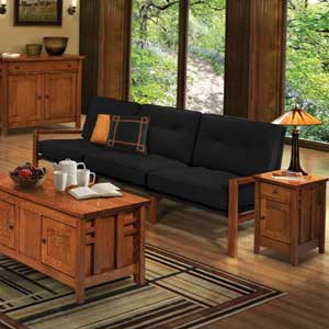
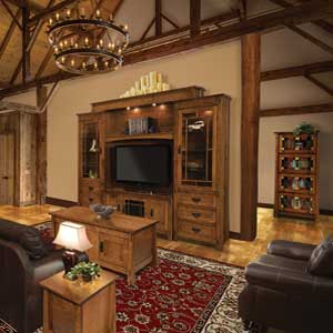
Living Room
Approach:
Mix 2-3 wood tones with one dominant. Balance heavy pieces (entertainment center) with lighter accent tables.
Example Combinations:
- Oak entertainment center + maple side tables + walnut accents
- Walnut coffee table + oak bookcase + maple picture frames
- Cherry media console + oak end tables + maple accessories
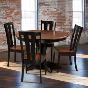
Dining Room
Approach:
Table and chairs can match or coordinate. Add contrast with buffet or china cabinet.
Example Combinations:
- Oak table and chairs + walnut buffet
- Cherry table + oak chairs + maple serving pieces
- Walnut table + lighter oak or maple chairs
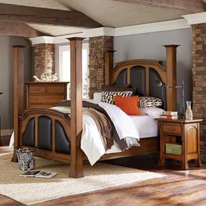
Bedroom
Approach:
Major pieces (bed, dresser) typically match. Add variety with nightstands or accent furniture.
Example Combinations:
- Cherry bed and dresser + maple nightstands
- Oak bedroom set + walnut bench and mirror frame
- Maple bed + oak dresser + cherry accessories
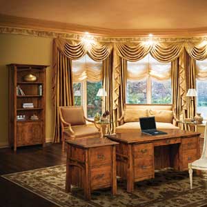
Home Office
Approach:
Desk as focal point, coordinate bookcases and filing cabinets with complementary tones.
Example Combinations:
- Walnut desk + oak bookcase + maple accessories
- Oak desk + cherry filing cabinet + maple shelving
- Cherry desk + walnut bookcase + oak picture frames
Coordinating Wood Tones with Flooring
General Guidelines:
- Furniture should contrast with flooring (not match exactly)
- Light floors: Use medium to dark furniture
- Medium floors: Any furniture tone works
- Dark floors: Light to medium furniture prevents heaviness
Specific Pairings:
- Light Oak Floors: Cherry, walnut, or medium oak furniture
- Medium Oak Floors: Any wood tone works well
- Dark Walnut Floors: Maple, ash, or light oak furniture
- Cherry Floors: Oak, maple, or walnut furniture
Using Color to Tie Wood Tones Together
Wall Colors:
- Warm Woods (oak, cherry): Cream, warm gray, sage, soft blue
- Cool Woods (maple, ash): Cool gray, white, soft blue-gray
- Dark Woods (walnut): Light neutrals, soft white, pale gray
Textiles and Accessories:
- Use fabrics to bridge different wood tones
- Incorporate colors that complement all wood species present
- Neutral textiles work with any wood combination
- Add pops of color that harmonize with wood undertones
Common Mistakes to Avoid
Don't:
- Try to match wood tones exactly (looks forced)
- Mix more than 3-4 different wood species in one room
- Ignore undertones (warm vs. cool)
- Use all the same tone (lacks depth and interest)
- Forget about wood grain patterns (vary these too)
- Overlook flooring as part of your wood tone count
Do:
- Vary tones intentionally (light, medium, dark)
- Maintain consistent undertones
- Use the 60-30-10 rule
- Consider how cherry will darken over time
- Test furniture placement before committing
- Use area rugs to separate wood tones visually
Transitioning Between Rooms
Creating Flow:
- Repeat at least one wood tone in adjacent rooms
- Use consistent undertones throughout home
- Transition gradually from light to dark (or vice versa)
- Maintain similar style (traditional, contemporary) across spaces
Conclusion: Embrace Thoughtful Variety
Successfully matching Amish furniture with wood tones isn't about perfect uniformity—it's about creating intentional variety that showcases the unique beauty of each wood species while maintaining visual harmony. By understanding undertones, using the 60-30-10 rule, and thoughtfully coordinating pieces room by room, you can create spaces that feel cohesive, sophisticated, and authentically styled.
Frequently Asked Questions
Can you mix different wood tones in the same room?
Yes! Mixing 2-3 different wood tones creates depth and visual interest. Use the 60-30-10 rule: 60% dominant wood, 30% secondary wood, 10% accent wood. Ensure undertones (warm or cool) remain consistent for cohesion.
Does oak furniture go with cherry furniture?
Yes, oak and cherry pair beautifully together. Both have warm undertones that harmonize well. Use one as the dominant wood (60%) and the other as secondary (30%). The contrast between oak's golden tones and cherry's reddish hues creates visual interest.
Should furniture match wood floors?
No, furniture should contrast with flooring rather than match exactly. With light floors, use medium to dark furniture. With dark floors, use light to medium furniture. This creates visual separation and prevents the room from looking monotonous.
What colors go best with walnut furniture?
Walnut's rich, dark tones pair beautifully with light neutrals (cream, soft white, pale gray), cool blues, sage green, and warm taupes. Avoid dark walls which can make spaces feel heavy. Light walls create striking contrast that showcases walnut's beauty.


